Crash Course in Color: 5 Expert Tips to Pick a Palette That’ll Help Your House Sell
- Published on
- 6 min read
-
 Christine Bartsch Contributing AuthorClose
Christine Bartsch Contributing Author
Christine Bartsch Contributing AuthorClose
Christine Bartsch Contributing AuthorFormer art and design instructor Christine Bartsch holds an MFA in creative writing from Spalding University. Launching her writing career in 2007, Christine has crafted interior design content for companies including USA Today and Houzz.
Filling your house with color like you’re Phoebe on Friends is fine when you’re a homeowner — but that changes the minute you decide to put your house on the market. “When you’re repainting to sell, your color preferences don’t matter anymore. You’re painting for the masses,” says Paul Wheeler, a top-selling real estate agent in Tulsa, Oklahoma.
According to HomeLight’s Top Agent Insights Survey for Q1 2020, 98% of top agents say that buyers prefer neutral colors over bold ones. We’re here to help you strike the right balance between boring and beautiful, and guide you toward the right colors to use for home staging based on where you live and your unique property.
Use bright trending colors sparingly, if at all
If you’re not careful, you might pick a trending color that’s wildly popular in the media — but not among homebuyers. For example, the Pantone Color Institute has named Living Coral as the 2019 Color of the Year.
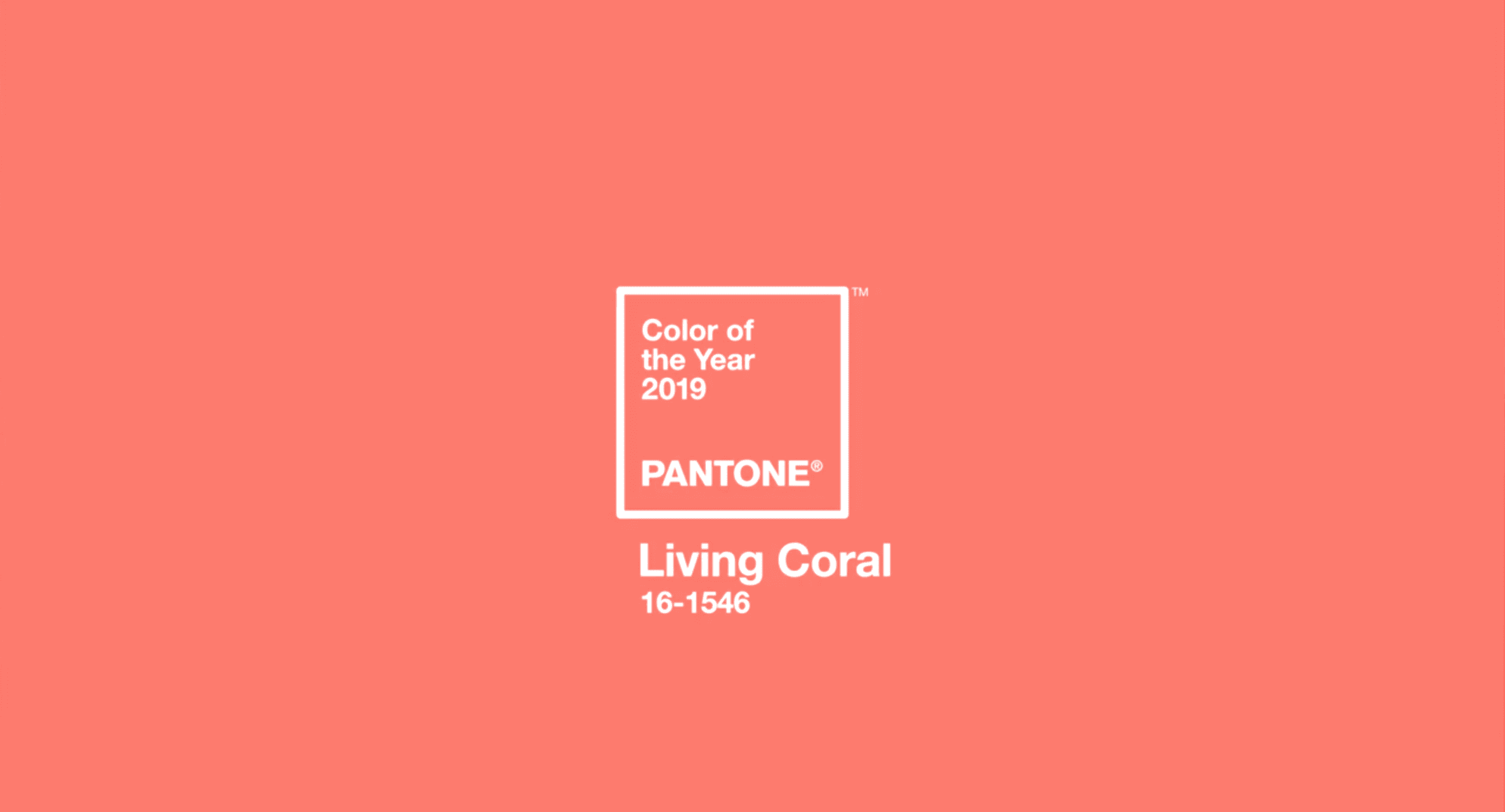
This is a beautiful hue that might add a nice pop of color as a decorative accent, but you don’t want to put this color on your walls if you’re planning to sell your house.
“On-trend colors can be good for selling your home in certain instances but, on balance, our advice would be to use neutrals for wall colors,” says Nicole Grey, Interior Design Lead at the UK-based luxury furniture and accessories company Pavilion Broadway.
“Save any bolder splashes of color — such as Pantone’s color of the year — for accessories which are not permanent, so the buyer will not be swayed by their presence in the scheme.”
However, a color that’s currently hot among top-tier designers might not even be the best idea as an accent color if your house isn’t located in a major metropolitan area.
“Just because a color is popular in magazines doesn’t mean it will add value to a house in your area,” advises Wheeler. “Cutting edge colors only work in cutting edge areas. Places like New York or L.A. pick up color trends first, then they trickle down to the middle of the country a few years later. So if we’re too far ahead of the trends, buyers aren’t going to like it.”

Pick the right neutral for your area and house
Sticking with neutral hues is good advice when picking a color that’ll stay on the walls long after your home is sold. However, neutrals don’t all have the same level of appeal. In fact, you might be surprised to learn that there are actually color trends among neutrals — especially in real estate.
“Color trends change so frequently in the real estate business. I call it the 8- to 10-year phenomenon because color trends change dramatically in that amount of time. So, wall colors that were popular a couple of years ago might not be now,” explains Wheeler.
Cream and beige hues like eggshell or ecru are often the go-to neutrals for sellers who don’t do their research, however, the world of neutrals has a whole host of hues to choose from. Right now, grays are trending. According to HomeLight’s research, nearly 80% of top agents across the country say that gray tones are preferred among buyers as of Q1 2020.
Selecting a neutral hue that’s trending in residential real estate home sales is typically a smart move — but it’s not foolproof. The most popular neutral may look wrong in your home depending on a variety of factors, like the temperature of the colors already in the room, or the color cast created by your lighting.
Luckily, color experts have come up with a number of tricks to help you pick the right trending neutral for your home.
1. Use color temperatures to identify the hidden hues in neutrals
Take a stroll through the paint department at your local hardware store and you’ll find thousands of neutral hues that are all different by a skosh. There are so many variations because each color is lighter, darker, warmer or cooler than the next neutral. That’s why picking a wall color isn’t as simple as deciding between white, cream, beige, or gray.
Known as undertones, the hidden depths of color within every neutral will help you pick a neutral paint that won’t end up looking like a dingy gray, a sickly yellow, or an insipid pink once you put it on your walls.
In fact, you may be surprised at how many colors it actually takes to mix up your neutral hue. Here’s a simplified crash course on how color mixing works with neutrals:
- The three base neutrals are pure white, pure black, and brown.
- Mix one part white with one part black and you’ll get the fourth neutral: base gray.
- Base brown is made by mixing equal parts of the three primary colors: yellow, red, and blue.
- Add a little white to any color and it becomes lighter in a process called tinting.
- Add a little black to any color and it becomes darker or deeper in a process called shading.
- Most neutrals begin with a large amount of base white mixed with a small amount of black and/or brown.
Understanding how to blend up a neutral color is pretty simple until you throw brown into the mix.
This is because brown is made from the three primary hues that are used to create all colors. (Red and blue make purple; blue and yellow make green; yellow and red make orange.)
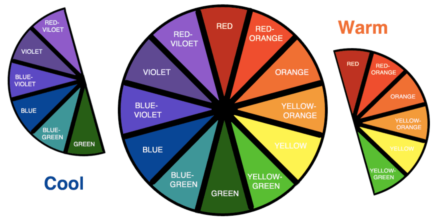
That’s why adding brown to any color — including base white, black, or gray — changes the color temperature to either warm or cool. Base brown may be made up of equal parts of all colors, but when you chance up that ratio, you change its visual temperature.
Warmer shades of brown, like amber or terra cotta, have more yellow or red than blue. Cooler browns, like wenge or Appalachian, have more blue than red or yellow.
Tint white with a warm brown, and you’ll get a cheery, warm neutral like cream, or almond. Tint white with a cool brown, and you’ll get a soft, subtle neutral like taupe, or fawn.
Understanding the difference between warm and cool neutrals is essential when picking out a wall color because color temperature is relative.
This means that how the color looks on the wall can change depending on the other elements in the room, including the furniture, woodwork, appliances, and even the light fixtures.
“A good rule is to think about the depth of the color on your fixtures and match this with the same tone of depth on the walls,” says Grey. “For instance, if you have warm creamy cupboards, choose a warm-toned neutral for the walls, instead of cool tones which will not match.”
Just make sure that the neutral you select for your walls is inspired by the undertones of items staying put in your house, like the cabinetry, fixtures, or wood trim, rather than your personal furniture.
2. Explore the impact of lighting on your color palette
Have you ever purchased an item, like an outfit or bedding, because you fell in love with the color? Then, once you get your beloved purchase home, you discover that the color isn’t as appealing as you thought?
Don’t feel guilty about your fickleness. Lighting is probably to blame.
The artificial light of light bulbs has a color temperature that’s measured by Kelvins that can drastically change the appearance of a color.
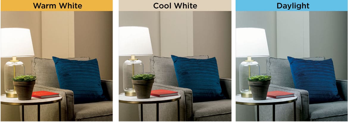
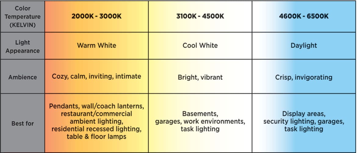
“A lot of sellers make the mistake of picking their color in the paint store,” says Wheeler. “But a color that looks good under that fluorescent lighting may actually have a yellowish tint when you put it on your walls.”
A lot of color issues in your home can be improved simply by changing out the type of light bulb and the color of light it emits, such as soft white, bright white, or daylight.
Of course, swapping out light bulbs won’t fix your color issues if it’s your home’s natural light that’s causing the problem. “The natural light in the room, and which direction the room is facing is a key consideration,” advises Grey.
Here’s her best color recommendations to accommodate the natural lighting in rooms facing any direction:
- Sunny, south-facing rooms: “A pale color can make the room feel bigger and lighter.”
- East-facing rooms: “These rooms look warmer and brighter in the morning, compared to in the afternoon.” So pick a versatile neutral.
- West-facing rooms: “Neutrals with a slightly warm base would work well here.”
- Darker north-facing rooms: “You may be tempted to embrace darker colors, but for home staging it’s far better to use warm, sophisticated neutrals to lighten the room and give the appearance of space.”
3. Limit yourself to three colors, max
Picking out the neutral paint color for your walls is by far the biggest color choice you’ll need to make, but it’s far from the only color in your house.
All the big items in each room play a role in its color scheme: both permanent features (door and window trim, natural-material fireplaces, appliances, light fixtures, plumbing finishes, etc.), and your personal belongings (furniture, artwork, decorative items, etc.).
As long as the house is your home, you can cram as many colors in your space as you please. But when you’re staging to sell, you need to limit the number of colors in each room so they don’t overwhelm potential buyers.
“The three Cs of staging are clean, clutter, and color. If you have too many colors, or you change colors in every room, you’re just going to distract buyers, even if you’ve deep cleaned and decluttered your house,” advises Wheeler. “Instead, you want a color palette that goes with most furniture and belongings.
However, the tri-color story you’re telling only refers to those hues that are meant to draw the buyer’s eye:
- Your wall color
- Your furniture color
- Your decorative accent color
So, you don’t need to get crazy painting all of your doors, fireplaces, window frames, and wood trim in the neutral you’ve picked for your walls.
If you’ve played it smart and picked a neutral wall color that complements the undertones of those permanent features, they become part of your neutral base — meaning they don’t count against one of your three colors.
4. Balance color with the 60-30-10 rule
Since your wall color will be a subtle neutral, you can get a little bolder with the last two colors in your palette with help from a design trick known as the 60-30-10 rule.
The 60-30-10 rule is a simple way to keep bolder colors from overwhelming your color palette. It works by rationing the amount of color in your rooms by simple percentages:
- 60% dominant color: the main color in the room (your neutral wall color)
- 30% secondary color: typically, this is the color of the larger items in the room (your furniture, drapes, etc.)
- 10% accent color: while this color is the least in volume, it’s often the brightest color pop in the room (artwork, throw pillows, vases, etc.)
Painting your interiors makes sense, but you might not want to invest a lot of money in replacing furniture that doesn’t go with your color scheme. So don’t!
“Once you have chosen your base color, you can start adding accents to build up a layered palette,” suggests Grey. “If your sofas and chairs don’t fit the neutral scheme because they are too bright, pop a throw over them to tone them down.”
Changing the look of upholstered furniture is simple with a little assistance from neutral slipcovers. Just don’t get too matchy-matchy with your wall color.
A tan couch against a tan wall will blend in and create a bland, boring look. So, don’t be afraid to add a little contrast with deeper, darker hues that still qualify as neutrals, such as dark grays, dark blues, or deep browns.
“Deeper colors are okay for upholstery, as long as they don’t jar the overall look,” advises Grey. “Accent colors are best injected by adding smaller pieces into the scheme, such as blankets, cushions, decorative accessories, or lamps.”
Even though you can get a little darker with your secondary, 30% color (aka your furniture), it still needs to stay in neutral territory so that buyers will focus more on the rooms themselves, rather than your personal taste.
However, it’s totally OK to get a bit playful with your accent color, like incorporating color pops of sunshine yellow, cheery red, or even that eye-catching Pantone color of the year, living coral.
And the good news is—as long as you have the same neutral wall color throughout the house—you can feature different accent colors (and even subtly different secondary colors) in every room without creating color confusion.

5. Play with tints and shades
You probably weren’t thinking about creating a cohesive tri-color story when you originally purchased your furniture and décor. Chances are your house is filled with items that aren’t one of the three colors you’ve chosen to highlight in each room.
However, there’s no need to purge your home of all colors that don’t exactly match your chosen color scheme. There’s an easy trick to increase your color options and all it takes is a quick trip to the paint section in your local hardware store.
Remember that info on tinting and shading in the crash course on color in tip one?
Well, tints and shades of your three main colors are a great way to expand your color palette without any risk of clashing colors. All you need to do is find your three chosen colors on multi-hue paint chip strips. These are ready-made samples of lighter and darker versions of your chosen hue that you can incorporate to deepen the layers of your color scheme without technically adding a fourth color.
Creating a cohesive color palette will probably require spending a little money, but it doesn’t have to be expensive. Discount store duvets for your bedding and slipcovers for your furniture let you dramatically change the look of a room without spending a lot of cash. And discount home goods stores are a great place to pick up low-cost decorative accents, too.
“A little money spent on accessories, slipcovers and a few plants will go a long way,” says Grey. “It’s these elements that will help to pull everything together and give the impression of a well-styled home that your buyer could see themselves living in. Artwork, in particular, will help to make your home feel lived in and, therefore, appealing to buyers.”
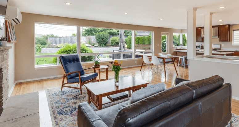
Header Image Source: (Francesca Tosolini / Unsplash)
All product names, logos, and brands are property of their respective owners. All company, product and service names used in this website are for identification purposes only. Use of these names, logos, and brands does not imply endorsement or any affiliation with HomeLight.
At HomeLight, our vision is a world where every real estate transaction is simple, certain, and satisfying. Therefore, we promote strict editorial integrity in each of our posts.